
A while ago I figured out a quick and dirty way of forcing text over the featured image.
While working on positioning text over a featured image I eventually found a much better solution.
This was of course before I created my feature page template.
So if I have any readers that aren’t bots for gummies and drugs this may seem familiar.
Test Within A Container
This simple bit of codes positions a piece of text over a container.
<div id="container" style="position: relative;width:100%;height:100px;background:yellow">
<div id="d1" style="z-index: 1; position:absolute; width: 100%;height:100%;background:red;"></div>
<div id="d2" style="z-index: 2; position:absolute; width: 100%;height:20px;background:blue;top:50%;text-align:center;color: white;">Text</div>
</div>
Which results in something that looks like this:
Text Over Image
After figuring out position with div classes I tried with an image.
<div id="container" style="position: relative; width: 100%;">
<img src="https://davidstockdalescrapcode.co.uk/wp-content/uploads/2021/04/Tech-Priest-Glow.jpg" alt="" style="width: 100%; height: 100%;" class="wp-image-532"/>

<div id="d2" style="z-index: 2; position: absolute; width: 100%; top: 50%; text-align: center; color: white;">
<h3 class="has-text-align-center">TEST</h1>
</div>

</div>
This was the result:
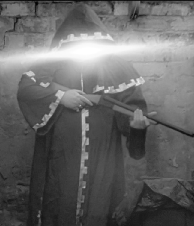
TEST
Final Solution (Resize For Small Screens)
Finally I put this into practice on a site.
I found that the most important thing is sizing everything correctly.
Since a responsive website will often resize images on screens of different sizes, any text you place over it must change with it or ruin the look.
This becomes even more complicated if you have multiple pieces of text over the same image as different image sizes required different text sizes and different positions.
Here’s an en example that I worked on involving a heading, a paragraph, a quote and a button all positioned over a single image:
<div id="container" style="position: relative; width: 100%;">
<img src="https://cultureagainstracism.flywheelsites.com/wp-content/uploads/2021/06/clay-banks-qT7fZVbDcqE-unsplash-2048x1366.jpg" alt="" style="width: 100%; height: 100%;" class="wp-image-532"/>

<div id="innerdiv2" style="z-index: 2; position: absolute; text-align: center; color: white;">
<h1 class="has-text-align-center">WE STAND TO DENOUNCE RACISM</h1>

<p class="has-text-align-center"><strong>We need you, cultural and all other organisations and practitioners in North East England - to create an anti-racist culture, not just make a statement.</strong></p>

<blockquote class="wp-block-quote has-text-align-center"><p>Our vision of change involves cohesive participation, action and accountability.</p></blockquote>

<div class="wp-block-buttons is-content-justification-center"><!-- wp:button {"className":"is-style-outline featuretext3"} -->
<div class="wp-block-button is-style-outline"><a class="wp-block-button__link" href="/join-us">Join Us</a></div>
</div>


</div>
</div>
Which with a lot of styling based on screen size came to look something like this:


Here’s the styling I cobbled together to resize and reposition everything at various screen sizes:
/**
 * Styles the contents of
 * the custom html
 * used to overlay
 * text onto images.
 */
#innerdiv2 {
	width: 100%!important;
	top: 20%;
}
#innerdiv2 > h1 {
	font-size: 5em;
}
#innerdiv2 > p {
	font-size: 2em;
}
#innerdiv2 .wp-block-button__link {
	color:blue;
}
#innerdiv2 > blockquote  {
	border-left:none;
}
/**
 * Repositions contents
 * to fit within the image
 * on various screen sizes.
 */
@media only screen and (max-width: 990px) {
	#innerdiv2 {
		top: 10%;
	}
	#innerdiv2 > h1 {
		font-size: 3.5em;
	}
	#innerdiv2 > p {
		font-size: 1.5em;
	}
}
@media only screen and (max-width: 780px) {
	#innerdiv2 {
		top: 5%;
	}
	#innerdiv2 > h1 {
		font-size: 2em;
	}
	#innerdiv2 > p {
		font-size: 1.2em;
	}
	#innerdiv2 > blockquote > p {
		font-size: 1em;
		border-left:none;
	}
}
@media only screen and (max-width: 500px) {
	#innerdiv2 {
		top: 0%;
	}
	#innerdiv2 > h1 {
		font-size: 1.5em;
	}
	#innerdiv2 > p {
		font-size: 0.8em;
	}
	#innerdiv2 .wp-block-button__link {
		font-size: 0.6em;
	}
	#innerdiv2 > blockquote > p {
		font-size: 0.8em;
	}
}
@media only screen and (max-width: 385px) {
	#innerdiv2 {
		top: 0%;
	}
	#innerdiv2 > h1 {
		font-size: 0.9em;
	}
	#innerdiv2 > p {
		font-size: 0.6em;
	}
	#innerdiv2 .wp-block-button__link {
		font-size: 0.6em;
	}
	#innerdiv2 > blockquote > p {
		font-size: 0.6em;
	}
}
